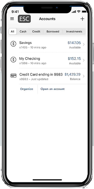
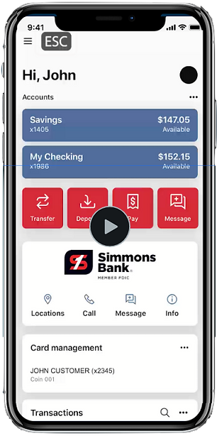
Demo
Interactive Video Demos
Our Team
Alex Carriles (Solo Project)
My Role
UX Designer
Programmer
Timeframe
6 weeks
Problem
There are several powerpoint-style walkthroughs and dozens of pages worth of documentation to aid people with their mobile and online banking experiences. How might I be able to craft a more effective means of training users while keeping them engaged?
Solution
We observed that users enjoy two things: having options and being able to go at their own pace. Both of these attributes give users a sense of control that keeps them engaged and promotes discovery and learning.

Features

Free
Flow
easily navigate to what you want when you want.

Guided
Tours
Step by step guides that show you how to do it.

Multi
Platform
works on desktop
and mobile.

AI Voices
complex AI Generated voices: any language, any dialect.

Time
Stamps
Send links that jump
to specific points in
the demo.

Accessibility
Closed Captioning and ADA Compliant Descriptive Transcripts.

User Testing
Key Takeaways

Free
Flow
Insight: Users would try to navigate between sections while walkthroughs were currently ongoing and were forced to wait until the walkthrough was finished to continue.
SOLUTION: active hotspots were enabled at all times allowing for users to interrupt the demo at any time and navigate freely.

Guided
Tours
Insight: Audio visual walkthroughs were extremely effective but people had a hard time understanding what the steps were.
SOLUTION: add highlights to buttons and sections to emphasize user steps.

Multi
Platform
Insight: platform specific problems arose.
ex. "ESC" key is used to exit the online demo but mobile lacks a keyboard.
SOLUTION: "ESC" button added to mobile demo for exiting the demo.

Time Stamps
Accessibility
Insight: timestamp links & Descriptive transcripts were difficult to maintain updated due to constantly shifting time codes after feature updates.
SOLUTION: Demos rebuilt in a modular way that allowed for previous content to remain time-locked and new content to be added easily.
Built with purpose
Because mobile & online platforms are constantly being updated with new features added quarterly, the demo structures are built modularly.
This allows for quick and simple snap-n-go updates to be rolled out at lightning quick turnaround times with minimal to no disruption in other sections

Demos


Mobile

Online

Postmortem
Additional features for future iterations include:
• More optimization to reduce file size and performance speeds
• New menu navigation for an even simpler and more intuitive experience
• Linking user data to demo so users can see their actual accounts for more accurate support

